RealtorHub
A mobile app that connects clients with trusted real estate agents and simplifies the home search experience.
Objectives
Course project · George Brown College | To create a seamless real estate journey by designing a mobile app that simplifies agent selection and builds trust through transparent communication.
My Role
UX Research
Service Design
Wireframing
Prototyping
Visual Design
Team
Solo
Tools
Figma
Photoshop
Miro
Duration
Research · 4 weeks
Prototyping · 4 weeks

The Challenge
70k
real estate agents exist in Toronto alone. With so many options, a client’s real estate experience becomes overwhelming.
32%
of Canadians feel that realtors are not transparent with their skills, experience, and credentials.
51%
of Canadians feel that realtors care more about their commission than their needs as clients.
How can we help clients find the perfect agent to make their real estate journey smooth and successful?
RealtorHub is a real estate app that helps clients find trustworthy agents faster through verified reviews, client testimonials, and filters. It simplifies the agent selection process and ensures a personalized search aligned with client goals; turning an overwhelming task into a confident, guided journey.
The Solution

Key Features
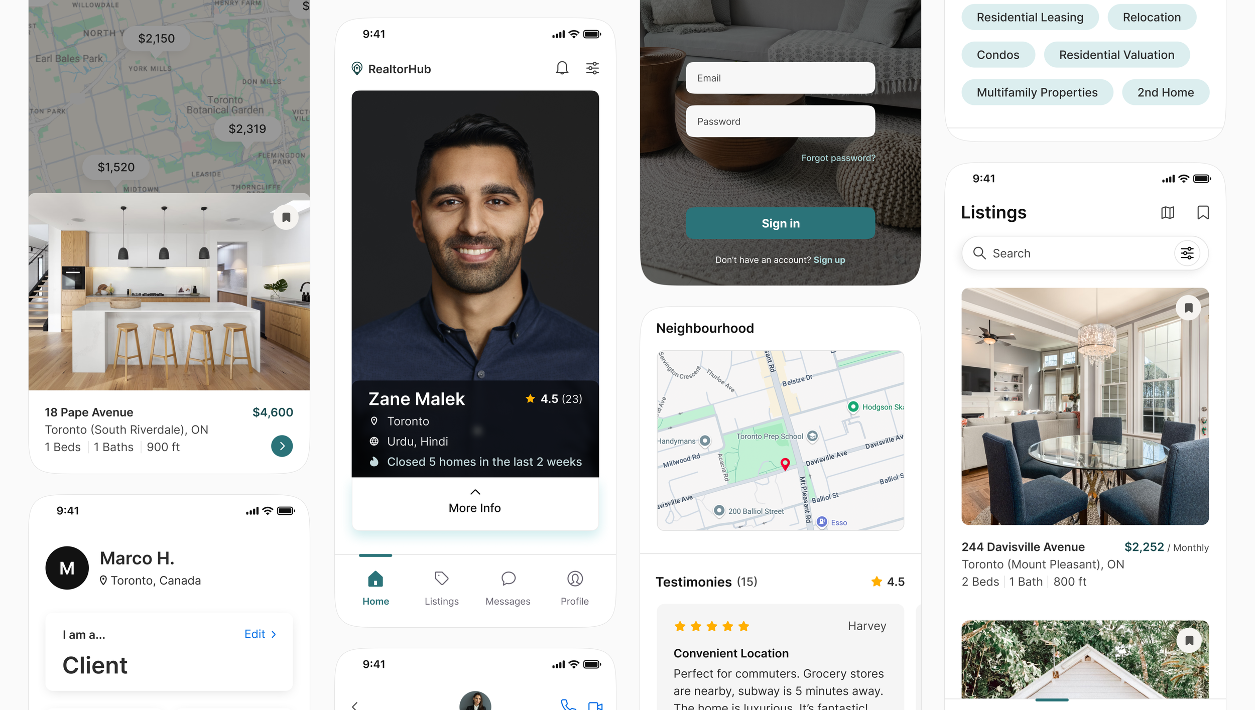
Swipe Interface
Minimizing the effort needed to find the perfect agent starts with creating simple interactions, requiring only a swipe. Agents can simultaneously swipe to find a home they’re interested to take on and match with.
Detailed Agent Profile
Agent profiles include detailed personal and professional information, as well as testimonies from past clientele.
Listings
Users looking for homes to rent and buy can view the neighbourhood, highlights, and testimonies from past occupants, giving them the information they need to make confident, informed decisions.
Interactive visual map
Designed for visual clarity and ease of exploration, properties are displayed on a map to help users quickly identify homes based on their preferred neighbourhoods and price range.
Direct Messaging
Instant messaging eliminates the need to switch platforms, draft formal messages, or wait for long email replies. It mirrors how people naturally communicate today, through quick, instant conversation.
User Profile
User’s have quick access to their role, rating, and key documents. Quick-access settings ensure users can manage their preferences smoothly while keeping everything organized in one place.
Qualitative Interviews
I spoke to renters, first-time buyers, and experienced homeowners between the ages of 21-58 to understand how a lack of transparent information affects their trust, decision-making, and overall search experience.
Insights
Research
2 RENTERS
to understand the difficulty of finding listings and trustworthy agents for short-term or budget-conscious moves.
1.
Real estate seekers rarely receive honest, detailed feedback about agents; making it hard to assess fit or credibility.
2.
3 FIRST-TIME BUYERS
to learn how uncertainty and lack of experience shape their expectations when choosing an agent.
3 EXPERIENCED HOME OWNERS
to explore how prior interactions with agents influence their trust and expectations in future transactions.
3.
They are overwhelmed and uncertain because there are too many agents and no easy way to compare or verify them.
A poor match with an agent can waste time, cause stress, and derail major housing decisions.
Competitive Analysis
Analyzing competitors’ strengths and flaws allowed me to come with potential high-impact low-effort solutions.

Instant messaging to allow for fast, direct communication, speeding up decision-making and reducing delays.

Swipe interface ensures mutual interest before messaging, to minimize unwanted outreach.

Filters help users find agents and listings that match their specific needs.

Ratings and testimonials from past clients to highlight agent compatibility.
User Flow
Before ideating, I mapped out the interaction for clients that are looking for a real estate agent with the goal to help them find the perfect agent as smoothly and efficiently as possible.
Wireframes
I created mid-fidelity prototypes to showcase key features designed to streamline the real estate experience for clients.
Prototype


Usability Testing

Cognitive overload: Users had difficulty remembering which direction to swipe so they relied on the like/dislike buttons on the bottom, rendering the swipe interface useless.

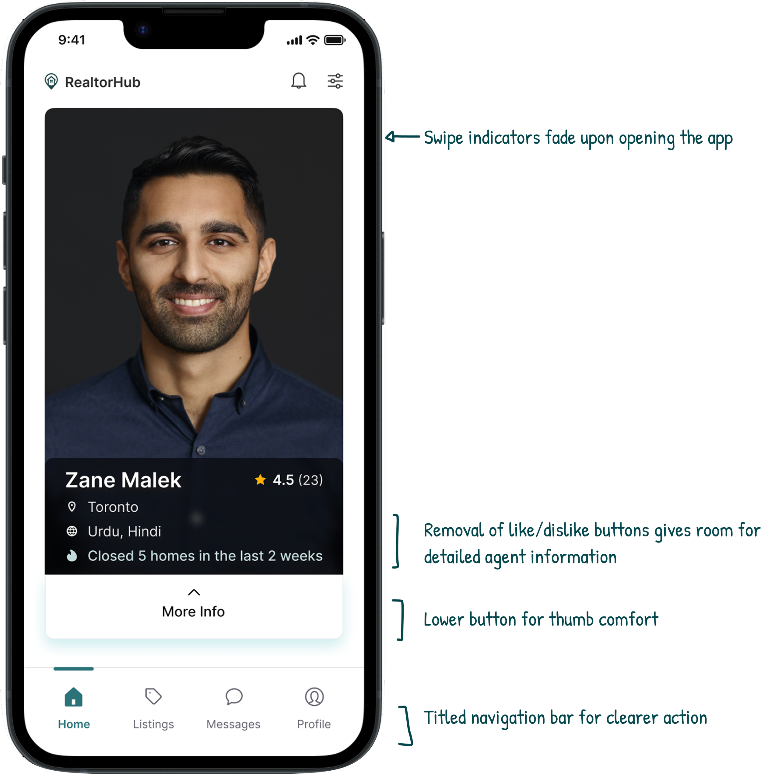
Button mayhem: The button to open agent profiles on the top right corner was uncomfortable for their thumbs.
Listings screen: Users were slow and hesitant to recognizing it on the navigation bar. Users also wanted a visual map to view property.
Revisions
Upon revisions, a second round of usability testing was done. Feedback was positive. Users had a 60% faster response time with swipe indicators, as well as a 30% faster response time with navigation titles.
Takeaways
Prioritizing simplicity
Throughout the project, I realized how easy it is to over-design and overcomplicate simple matters. Early iterations included too many features that cluttered the user experience and took away from the actual goal of the app. Through user feedback and critical self-review, I learned to narrow down to the most basic and essential functions. This shift towards simplicity improved usability, and helped me grow as a more thoughtful designer.
Next steps
If I were to continue this project, I’d focus on usability testing through the agents’ perspective to refine any mismatch in flow. I’d also explore lightweight educational tools for first-time buyers and renters, as well as analytics tools for agents to track client activity.